Harvard versus USDA: Whose Plate Wins?

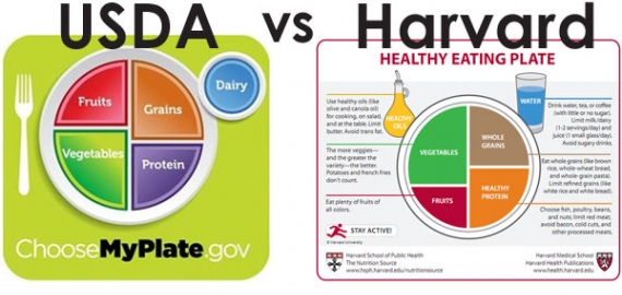
(HealthCastle.com) As an alternative to the USDA MyPlate icon, the Harvard School of Public Health has published their version, called the Healthy Eating Plate. Is this an improved version of the USDA MyPlate?
What We Like about the Harvard Healthy Eating Plate:
- Water as your main beverage. The Harvard Plate shows a water icon for the beverage (instead of the dairy in the USDA MyPlate). While dairy products have their place in a balanced diet, emphasizing dairy is unnecessary. We agree with making water the main beverage of choice.
- Not all proteins are created equal. The Harvard Plate goes further in distinguishing between good quality protein sources (such as fish, beans), types to limit (red meat) and those to avoid (processed meats).
- Not all grains are created equal. Similar to its stance on protein, the Harvard Plate encourages regular consumption of whole grains and limiting refined grain products.
- Get more veggies than fruit. Fruit is great, but the reality is that many of us don't get enough veggies in a day, so the visual emphasis on veggies taking up a larger portion of the plate than fruit is useful. (The Harvard folks even go as far as to say that potatoes and French fries do not count toward your veggies allotment, which speaks volumes about the composition of our collective diet.)
What We Dislike:
- The visual representation of oils bothers us because it shows up as a large bottle of yellow liquid. The bottle of oil may make users wonder about sugar, salt, butter, etc. We feel it simply creates confusion.
The Bottom Line
The Harvard Plate does contain useful messages about healthy eating. However, at the end of the day, no fancy icon can replace real daily actions for a healthier way of eating.
-
Quick Weight Loss – How To Burn Fat Fast!
Easy weight loss is the goal of everyone wanting to get thin and look
-
5 Ways to Lose 20 pounds By Christmas
Ready to transform your life with a safe
-
Advantages Of Healthy Meal
A healthy meal, if we were to define it, is one prepared with the heal
-
5 Motivational Tips To Help You Lose Weight
It can feel quite difficult trying to lose weight, sometimes even more
-
Slim Fast - Does It Work?
Dieting with Slim Fast Slim Fast is ano
-
Why Most Diets Fail In The Long-Term
A comprehensive review of diet solutions leads to a number of conclusi
- DON'T MISS
- *** Perfect Weight America - Much More Than Just Another Weight Loss Diet Program
- Cellulean Reviews: My Comprehensive Cellulean Review
- Isometrics Is The Key To Success - Fad Diets, Quick Weight Loss ... Ultimate Failure
- Weight Loss Services - Laser Liposuction, Hcg Weight Loss From Weight Loss Clinic
- South Beach Diet Information And Recipes
- Cheap Equipment For Fitness Training
- The power of living The Mediterranean Diet
- Weight Loss Tips That Can Give You Back Your Figure
- How To Have A Healthy Weight Loss
- 3 Tips That Lead To Lasting Weight Loss


